
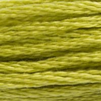
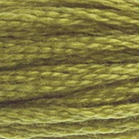
DMC 166 — Medium Light Moss Green
Greens family · Hex #C0C840
Quick Conversion Table
| Brand | Equivalent | Match |
|---|---|---|
| Anchor | 280 | close |
| Madeira | 1308 | close |
| Cosmo ⚠ | 972 | close |
| Sullivans | 45481 | close |
| J&P Coats | 6001 | close |
The Parrot Green That Designers Reach For
There's a reason DMC 166 keeps showing up in tropical bird patterns, and it's not just because parrots happen to be this color. It's because this particular shade of yellow-green — vivid, saturated, sitting right at the peak of our visual sensitivity range — demands the kind of attention that a bird perched in a jungle canopy demands. DMC 166, Medium Light Moss Green, is a statement color. It doesn't blend in. It doesn't recede. It announces itself with the confidence of a macaw screaming at dawn.
Compared to its lighter sibling DMC 165 (Very Light Moss Green), 166 has enough additional green depth to read clearly as green rather than hovering on the yellow border. But it retains tremendous warmth and energy — this is still firmly a yellow-green, with all the vibrancy that implies. The hex value shows strong yellow and green channels with almost no blue, producing a color that's pure, bright, and unapologetically intense.
Taming Intensity Through Palette Design
Working with a color this vivid requires thinking about the whole palette, not just the individual thread. Surrounded by muted, desaturated neighbors, DMC 166 will look almost garish. Paired with equally bold colors — DMC 606 (Bright Orange Red), DMC 820 (Very Dark Royal Blue), DMC 550 (Very Dark Violet) — it feels right at home. The key principle: match energy levels across your palette. Don't put 166 in a pastel composition unless you specifically want it to dominate everything around it.
For nature-themed work, 166 excels as the yellow-green highlight in foliage that's otherwise rendered in deeper, more muted greens. A canopy stitched primarily in DMC 3362 (Dark Pine Green) and DMC 3363 (Medium Pine Green) comes alive when you add scattered stitches of 166 where sunlight would catch the uppermost leaves. Used this way — as accent rather than fill — the intensity becomes an asset. Those bright stitches create the illusion of dappled light in a way that's genuinely hard to achieve otherwise.
Tropical and exotic plant designs are where 166 can stretch out and fill larger areas without overwhelming a piece. Banana leaves, philodendron fronds, monstera plants — these subjects expect vivid green, and the yellow-leaning warmth of 166 captures the lush, well-fed quality of tropical foliage. For a monstera leaf pattern, try combining 166 for the main leaf body with DMC 469 (Avocado Green) for the deeper vein areas and DMC 472 (Ultra Light Avocado Green) for where light hits the leaf edges.
Stitch Formation and Fabric Pairing
At this saturation level, stitch quality matters because the intensity amplifies imperfections. Twisted stitches, inconsistent tension, or unrailroaded strands create visible shadows within the bright green that look like dirt or damage rather than subtle texture. Take the time to railroad on any count above 14, and check your work every few rows. Frogging is always painful, but frogging a vivid color like 166 is especially annoying because the holes left behind can retain a faint green tint in the fabric that shows even after the stitches are removed.
On fabric selection: white Aida gives you maximum brightness, which is appropriate for graphic, modern designs. Natural or ivory evenweave grounds the yellow-green slightly, pulling back just enough intensity to work in traditional sampler contexts. Avoid pairing 166 with strongly dyed fabrics in warm colors — red or orange hand-dyed backgrounds will fight with this yellow-green in ways that are uncomfortable to look at for extended periods.
Finding substitutes for vivid, saturated yellow-greens is a precision exercise because your eye is extraordinarily sensitive to variations in this part of the spectrum. A substitute that looks identical under the store's fluorescent lights might reveal a green-ward or yellow-ward drift when you get it home and compare it to your existing DMC stitching under natural light.
Anchor 280 is the go-to cross-brand substitute and generally handles the saturation level well. Some stitchers note that Anchor's version leans imperceptibly more olive — a tiny addition of brown that tames the brightness by a single degree. In large fill areas this might actually be preferable if you found the DMC version overwhelming. In small accents where you want maximum pop, stick closer to the original.
Madeira 1308 captures the warmth and general character. Madeira's slightly silkier hand can make the color appear to shift under different viewing angles more than the matte DMC version does — think shot-silk effects on a microscopic scale. This is usually a positive trait in finished pieces displayed under varied lighting.
Cosmo 972 is worth sourcing if you prefer Cosmo's softer hand. It tends to mute the yellow-green intensity just slightly, which depending on your design could be exactly what you need or precisely what you want to avoid. Match to your palette context, not to the thread in isolation.
One important caution: DMC 166 and DMC 3819 (Light Moss Green) are close enough in hue that some stitchers confuse them, but they differ in value. 166 is darker and more saturated. Swapping one for the other will affect your shading progression.
Reference quality
How We Validate This Color Record
Use this page as a reference card for DMC 166: the structured data, quick conversions, and long-form copy are all tied back to the same stored color record.
- Methodology
- This page renders DMC 166, its hex value, and every brand equivalent from the site's source-of-truth color record, then checks long-form body copy against those same stored fields.
- Verification status
- Source-field checked. The page content is audited against the stored DMC number, brand equivalents, and match-quality labels before publishing.
- Last reviewed
- 2026-04-20
- Approximation warning
- Screen hex values, thread photos, and cross-brand conversions are reference aids. Dye lots, thread sheen, and fabric color can still shift the result in hand.
Decision guide
When to use the DMC 166 reference page
This page should help you decide faster between palette planning, brand substitution, and shade comparison without turning the color record into a thin lookup page.
Best for
- + Palette planning when you want the stored DMC 166 Medium Light Moss Green record, hex value #C0C840, and linked brand equivalents in one place.
- + Checking the quickest cross-brand shortlist before you buy floss, compare stash substitutes, or route into a more specific conversion page.
- + Finding nearby shades in the greens family before you commit to accents, shading, or background blends.
Watch for
- ! Screen previews are only reference aids. Medium Light Moss Green can shift on real fabric because thread sheen, stitch coverage, and room lighting change how the color reads.
- ! A stored equivalent is still a shortlist, not a guarantee that two brands will disappear into each other in the same stitched motif.
- ! Older charts, discontinued kit floss, and dye-lot variation can all introduce small but visible differences that the page cannot detect for you.
Before you commit
- Confirm the role of DMC 166 Medium Light Moss Green: decide whether you need an exact hero shade, a forgiving background, or a rough stash substitute.
- Compare on project fabric: view the skein or stitched sample on the same fabric count and color you will actually use.
- Use the linked conversion pages next: open the brand-specific pages when you need match-quality caveats before substituting away from the DMC reference.
DMC 166 FAQ
These questions appear on the page so the FAQ schema stays aligned with what visitors can actually read.
What is the Anchor equivalent of DMC 166?+
The closest Anchor equivalent to DMC 166 (Medium Light Moss Green) is Anchor 280. This is a close match.
What color is DMC 166?+
DMC 166 is called "Medium Light Moss Green" and has a hex color value of #C0C840. It belongs to the greens color family.
What is the Madeira equivalent of DMC 166?+
The closest Madeira equivalent to DMC 166 (Medium Light Moss Green) is Madeira 1308. This is a close match.
How DMC 166 Looks on Fabric
The same thread appears different depending on your fabric. Always test on your project fabric.
White Aida
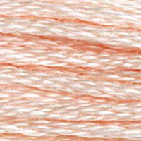
Cream / Ecru
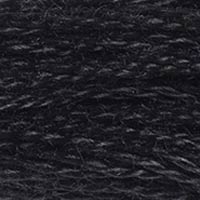
Black Aida
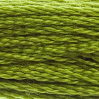
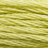
Pairs Well With
DMC colors commonly used alongside 166 Medium Light Moss Green.
Suggested Palette
Shading Companions
Detailed Conversions
Where to Buy DMC 166
This section contains affiliate links. We may earn a small commission at no cost to you.
Related Guides
Free Printable Thread Conversion Chart
Pick a brand, enter your email, and we'll send you a printable chart mapping all 552 DMC colors to that brand's equivalents. Zero spam, one chart.
Thanks! Here's your free chart:
Download Your ChartOpens in a new tab. Use your browser's Print → Save as PDF.
No spam. Your email is stored securely and never shared.