
Quick Conversion Table
| Brand | Equivalent | Match |
|---|---|---|
| Anchor | 256 | exact |
| Madeira | 1308 | close |
| Cosmo ⚠ | 271 | close |
| Sullivans | 45164 | close |
| J&P Coats | 6238 | close |
| Dimensions | 6060 | close |
| Bucilla | 2681 | close |
| Candamar | 6078 | close |
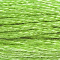
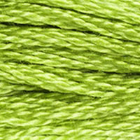
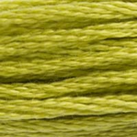
Some colors exist primarily to make other colors look better, and DMC 704 Bright Chartreuse is one of the finest examples of this supporting role. On its own, it's almost aggressively yellow-green — bright to the point of seeming difficult. Surrounded by deeper greens, darker foliage, or the rich jewel tones it complements, it transforms into exactly the right accent: the electric spark of sunlight hitting the edge of a leaf, the vivid tip of a tropical feather, the brilliant highlight that makes the whole palette snap into focus.
Brighter Than Chartreuse — The Extra Step
If DMC 703 Chartreuse is already a vivid yellow-green, DMC 704 is one step further — lighter in value and even more saturated at #9ECF34. The higher lightness makes it effectively a highlight-only color in most contexts; it's too pale and bright to carry mid-tone areas effectively. But as a highlight, it's unmatched in the chartreuse territory. Wherever nature produces that particular moment of near-fluorescent brightness at a leaf's sunny edge or at the brightest point of a reflective surface, 704 captures it.
This position at the top of the chartreuse value range also makes 704 useful in color sequences that include DMC 703. A three-value yellow-green sequence might run from DMC 905 or 895 (deep shadow), through DMC 703 (mid-tone), to 704 (highlight). This sequence is particularly effective for tropical vegetation, detailed botanical pieces, and any design that needs the full range of a vivid, warm green without shifting into the Christmas Green family's cooler, purer territory.
Unexpected Applications
Pop culture and pixel-art designs often use 704 for vivid accent greens — it reads well in bold, graphic contexts where maximizing contrast and brightness is more important than subtle naturalism. Video game design cross stitch pieces (mushrooms, trees, alien vegetation) lean into 704's unreal brightness deliberately. Geometric and abstract designs that use chartreuse as a feature color similarly benefit from 704's intensity.
In floral embroidery, 704 appears in designs featuring flowers with chartreuse coloring — green chrysanthemums, certain orchid varieties, and botanical subjects where the foliage is actually this vivid. Chartreuse-green hydrangeas and certain hellebore varieties bloom in this territory, making 704 a botanically accurate choice for those specific subjects. Pair it with DMC 470 Light Avocado Green and DMC 936 Very Dark Avocado Green for a complete palette for green-bloomed plants.
Dye Lot Sensitivity
At this level of saturation and brightness, dye lot variation in DMC 704 can be more visible than in muted colors. Two skeins from different lots can read noticeably differently if placed side by side, especially under natural light where the yellow component shifts. For large fill areas worked over extended time periods where you may need to repurchase, buying all your 704 from the same lot at the start of the project is even more important than with most colors. The extra-vivid colors across the DMC range tend to be more dye-lot sensitive than the muted palette.
One final practical note: DMC 704 Bright Chartreuse is a color that photographs differently than it stitches. Its yellow-green brightness can read differently on screen depending on monitor calibration — which is why FlossTube and online cross stitch communities occasionally see debates about what 704 "really" looks like. The thread in hand, in natural daylight, is the authoritative reference. If you're selecting 704 based on an online color chart or a scanned pattern booklet, viewing the actual thread before making shading decisions involving its relationship with adjacent colors is worth the effort.
Anchor 256 is an exact match, which is reassuring given how specific 704's yellow-green brightness is. Madeira 1308 rates as close rather than exact — there's a slight difference in value or saturation that shows under careful comparison, though for most practical applications Madeira 1308 is a functional substitute.
Cosmo 271 and Sullivans 45164 are both close. Cosmo 271 tends to read as slightly less bright in the yellow direction — there's more pure-green character and less yellow-green warmth than in DMC 704. Sullivans 45164 is in similar territory. For designs where 704's specific brightness is a design element (graphic pop art, vivid tropical wildlife), compare swatches before committing. For highlight roles where the main requirement is "lighter and brighter than 703," either substitution works.
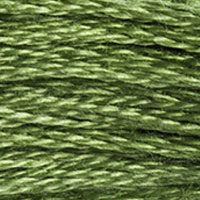
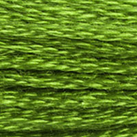
Within the DMC range, DMC 703 Chartreuse is the natural darker neighbor — if 704 is unavailable for highlight work, 703 can serve the same role at a slightly lower brightness, which usually means the designed highlights will read as slightly more reserved. DMC 472 Ultra Light Avocado Green is lighter still but shifts toward a softer, less saturated yellow-green. DMC 907 Light Parrot Green has a similar vivid quality but with more of a true lime character. For an improvised blend, two strands of DMC 703 with one strand of DMC 972 Burnt Orange sounds counterintuitive, but the orange strand slightly warms the yellow-green and brightens the perceived intensity — some experienced stitchers use unexpected blends like this to push saturation in highlight areas.
Reference quality
How We Validate This Color Record
Use this page as a reference card for DMC 704: the structured data, quick conversions, and long-form copy are all tied back to the same stored color record.
- Methodology
- This page renders DMC 704, its hex value, and every brand equivalent from the site's source-of-truth color record, then checks long-form body copy against those same stored fields.
- Verification status
- Source-field checked. The page content is audited against the stored DMC number, brand equivalents, and match-quality labels before publishing.
- Last reviewed
- 2026-04-20
- Approximation warning
- Screen hex values, thread photos, and cross-brand conversions are reference aids. Dye lots, thread sheen, and fabric color can still shift the result in hand.
Decision guide
When to use the DMC 704 reference page
This page should help you decide faster between palette planning, brand substitution, and shade comparison without turning the color record into a thin lookup page.
Best for
- + Palette planning when you want the stored DMC 704 Bright Chartreuse record, hex value #9ECF34, and linked brand equivalents in one place.
- + Checking the quickest cross-brand shortlist before you buy floss, compare stash substitutes, or route into a more specific conversion page.
- + Finding nearby shades in the greens family before you commit to accents, shading, or background blends.
Watch for
- ! Screen previews are only reference aids. Bright Chartreuse can shift on real fabric because thread sheen, stitch coverage, and room lighting change how the color reads.
- ! A stored equivalent is still a shortlist, not a guarantee that two brands will disappear into each other in the same stitched motif.
- ! Older charts, discontinued kit floss, and dye-lot variation can all introduce small but visible differences that the page cannot detect for you.
Before you commit
- Confirm the role of DMC 704 Bright Chartreuse: decide whether you need an exact hero shade, a forgiving background, or a rough stash substitute.
- Compare on project fabric: view the skein or stitched sample on the same fabric count and color you will actually use.
- Use the linked conversion pages next: open the brand-specific pages when you need match-quality caveats before substituting away from the DMC reference.
DMC 704 FAQ
These questions appear on the page so the FAQ schema stays aligned with what visitors can actually read.
What is the Anchor equivalent of DMC 704?+
The closest Anchor equivalent to DMC 704 (Bright Chartreuse) is Anchor 256. This is an exact match.
What color is DMC 704?+
DMC 704 is called "Bright Chartreuse" and has a hex color value of #9ECF34. It belongs to the greens color family.
What is the Madeira equivalent of DMC 704?+
The closest Madeira equivalent to DMC 704 (Bright Chartreuse) is Madeira 1308. This is a close match.
How DMC 704 Looks on Fabric
The same thread appears different depending on your fabric. Always test on your project fabric.
White Aida
Cream / Ecru
Black Aida
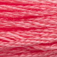
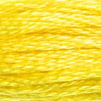
Pairs Well With
DMC colors commonly used alongside 704 Bright Chartreuse.
Detailed Conversions
Where to Buy DMC 704
This section contains affiliate links. We may earn a small commission at no cost to you.
Related Guides
Free Printable Thread Conversion Chart
Pick a brand, enter your email, and we'll send you a printable chart mapping all 552 DMC colors to that brand's equivalents. Zero spam, one chart.
Thanks! Here's your free chart:
Download Your ChartOpens in a new tab. Use your browser's Print → Save as PDF.
No spam. Your email is stored securely and never shared.