
Quick Conversion Table
| Brand | Equivalent | Match |
|---|---|---|
| Anchor | 316 | exact |
| Madeira | 0202 | exact |
| Cosmo ⚠ | 147 | close |
| Sullivans | 45181 | close |
| J&P Coats | 2327 | close |
| Dimensions | 12099 | close |
| Candamar | 6119 | close |
The Tropical Thread: DMC 740 and the Colors of Warm Climates
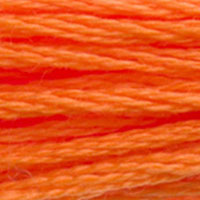
Bird of paradise flowers thrusting up from broad green leaves. Clownfish weaving through anemone tentacles. Monarch butterflies mid-migration, their wings backlit by afternoon sun. The molten edge of a tropical sunset where sky meets ocean. These are the images DMC 740 Tangerine was made for — warm, vivid, unapologetically saturated scenes that belong to places where the light is strong and the colors are not shy about it.
Look at the hex: #FF8B00. That is a maxed-out red channel, a green channel sitting at exactly the midpoint, and zero blue. From a color theory perspective, this is as close to a mathematically perfect orange as you will find in thread form. Orange is the mixture of red and yellow, and 740 lands precisely at the balance point — not red-orange, not yellow-orange, but the Platonic ideal of orange itself. DMC has hundreds of colors in its range, and most of them lean one direction or another. 740 sits dead center on the orange axis and dares you to find a purer version.
That purity is what gives it the tropical quality. In nature, the most intensely orange organisms tend to live in warm climates or shallow warm waters where bright coloration serves as either a mating signal or a warning. Clownfish, poison dart frogs, orioles, flame trees, bird of paradise flowers — they all share this specific, assertive, look-at-me orange. When you stitch any of these subjects, 740 is the thread that makes them read as alive rather than as a muted approximation.
Color Theory on the Needle
Understanding where 740 sits relative to other DMC oranges helps you build more intentional palettes. The orange family in DMC's range follows a spectrum from red-orange through pure orange to yellow-orange:
- DMC 608 (Bright Orange) — red-orange, hot, aggressive
- DMC 946 (Medium Burnt Orange) — darker red-orange, earthy
- DMC 740 (Tangerine) — pure orange, balanced, saturated
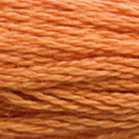
- DMC 970 (Light Pumpkin) — golden-orange, warm, amber-leaning
- DMC 947 (Burnt Orange) — lighter, slightly peachy
This gradient from 608 through 740 to 970 covers the core of the orange spectrum, and having all three in your stash gives you the ability to create dimension in any orange subject. A single flat shade of orange makes a pumpkin look like a circle. Three shades of orange — shadow, body, highlight — make it look round. 740 typically serves as the mid-tone body color, with 608 in the shadow creases and 970 catching the light on the forward-facing surfaces.
The relationship between warm and cool matters here too. Against blue backgrounds (DMC 796, 797, 798 for sky; DMC 3808, 3809, 3810 for ocean), 740 creates maximum contrast because orange and blue are complementary colors. This is not an accident of nature — it is why tropical sunsets are so visually arresting and why clownfish against blue water practically vibrate with color energy. Use this complementary relationship deliberately in your designs. A border of DMC 798 Dark Delft Blue around a motif stitched in 740 will make both colors appear more vivid than either would alone.
Stitching Characteristics and Fabric Considerations
At this saturation level, fabric choice matters enormously. On white Aida, 740 is bold and clean — the orange reads as graphic and modern, almost poster-like. This works beautifully for contemporary designs, geometric patterns, and stylized animal motifs where visual punch is the goal. On natural linen, 740 mellows slightly into something more organic, more like actual citrus peel than like a color swatch. Both effects are valid; they simply serve different design aesthetics.
Coverage is excellent. 740 is one of those threads that seems to fill fabric effortlessly — two strands on 14-count covers completely, and even on 18-count with two strands, you get solid, opaque color with no fabric peeking through. The thread separates cleanly from the skein, does not pill or fuzz excessively, and maintains tension well. For cross-country stitching across large areas of orange, it behaves predictably, which is all you can ask.
One practical note for over-one work on high-count fabric: 740's intensity means it can overpower delicate designs if used in large areas. A single strand on 28-count over one is still visually dominant. If your design calls for a softer orange in miniature work, consider DMC 3340 (Medium Apricot) or DMC 722 (Light Orange Spice) instead, and reserve 740 for small accent details where you want that pop of pure, undiluted orange.
Substituting DMC 740 Tangerine — and the Anchor 316 Problem
Here is where things get interesting, and not in a good way. Anchor 316 is listed as an exact match for DMC 740. It is also listed as a close match for DMC 970 (Light Pumpkin). These two DMC colors are not interchangeable — 740 is a pure, balanced orange while 970 is a warmer, more golden-amber orange. Yet Anchor maps one number to cover both. This means that if you are converting a pattern from DMC to Anchor and it calls for both 740 and 970, you will lose a color distinction. One of them has to give.
In practice, Anchor 316 is closer to DMC 740 than to 970. The hue is more purely orange than golden, and the saturation matches 740's intensity. If your project uses 740 alone, Anchor 316 is a reliable swap. If your project uses both 740 and 970, you will need to find a second Anchor shade to replace 970 — try Anchor 314 or search the Anchor range for a warmer, more amber orange. This is one of those cross-brand conversion headaches that has no perfect solution, only least-bad options.
Madeira 0202 is an exact match and does not share the doubling problem. Madeira's orange numbering maps more cleanly to DMC's range, giving each shade its own equivalent. The thread quality is comparable, coverage is similar, and the hue accuracy is strong. For stitchers who regularly substitute between brands, Madeira may actually be the more reliable partner for the orange family specifically because of this cleaner mapping.
Cosmo 147 is a close match. Cosmo threads have a distinctive soft, silky hand that many stitchers actively prefer over DMC, and their oranges are well-saturated. The 147 shade captures the essential character of 740's pure orange, though it may read very slightly less saturated in direct comparison. For projects where 740 is used as a bold accent rather than in large filled areas, the difference is academic. Cosmo's thread also tends to produce slightly flatter stitches due to its softer twist, which can be an advantage on higher-count fabrics where puffy stitches create unwanted texture.
Sullivans 45181 is rated close. Coverage with Sullivans threads can be slightly lighter than DMC at the same strand count, so test your coverage on a scrap of your project fabric before committing. If you find the orange looking thin or allowing fabric show-through, adding a third strand is a reasonable fix on 14-count, though it will change the texture of the stitched surface. The color itself is in the right neighborhood — a warm, saturated orange that reads as tangerine rather than pumpkin.
Within the DMC range, there is no true substitute for 740 because its defining quality is that precise middle-of-the-spectrum purity. DMC 741 (Medium Tangerine) is lighter and more washed out. DMC 947 steps lighter still with a peachy quality. Going darker, DMC 946 adds brown. 740 occupies its position alone, which is exactly what makes it valuable and exactly why getting the substitution right matters when you cannot source it.
Reference quality
How We Validate This Color Record
Use this page as a reference card for DMC 740: the structured data, quick conversions, and long-form copy are all tied back to the same stored color record.
- Methodology
- This page renders DMC 740, its hex value, and every brand equivalent from the site's source-of-truth color record, then checks long-form body copy against those same stored fields.
- Verification status
- Source-field checked. The page content is audited against the stored DMC number, brand equivalents, and match-quality labels before publishing.
- Last reviewed
- 2026-04-20
- Approximation warning
- Screen hex values, thread photos, and cross-brand conversions are reference aids. Dye lots, thread sheen, and fabric color can still shift the result in hand.
Decision guide
When to use the DMC 740 reference page
This page should help you decide faster between palette planning, brand substitution, and shade comparison without turning the color record into a thin lookup page.
Best for
- + Palette planning when you want the stored DMC 740 Tangerine record, hex value #FF8B00, and linked brand equivalents in one place.
- + Checking the quickest cross-brand shortlist before you buy floss, compare stash substitutes, or route into a more specific conversion page.
- + Finding nearby shades in the oranges family before you commit to accents, shading, or background blends.
Watch for
- ! Screen previews are only reference aids. Tangerine can shift on real fabric because thread sheen, stitch coverage, and room lighting change how the color reads.
- ! A stored equivalent is still a shortlist, not a guarantee that two brands will disappear into each other in the same stitched motif.
- ! Older charts, discontinued kit floss, and dye-lot variation can all introduce small but visible differences that the page cannot detect for you.
Before you commit
- Confirm the role of DMC 740 Tangerine: decide whether you need an exact hero shade, a forgiving background, or a rough stash substitute.
- Compare on project fabric: view the skein or stitched sample on the same fabric count and color you will actually use.
- Use the linked conversion pages next: open the brand-specific pages when you need match-quality caveats before substituting away from the DMC reference.
DMC 740 FAQ
These questions appear on the page so the FAQ schema stays aligned with what visitors can actually read.
What is the Anchor equivalent of DMC 740?+
The closest Anchor equivalent to DMC 740 (Tangerine) is Anchor 316. This is an exact match.
What color is DMC 740?+
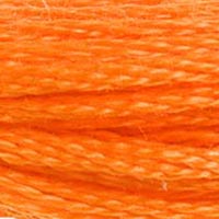
DMC 740 is called "Tangerine" and has a hex color value of #FF8B00. It belongs to the oranges color family.
What is the Madeira equivalent of DMC 740?+
The closest Madeira equivalent to DMC 740 (Tangerine) is Madeira 0202. This is an exact match.
Tropical and Nature Projects Built Around DMC 740
Clownfish patterns are perennially popular, and 740 is the non-negotiable anchor of the palette. The classic clown anemonefish (Amphiprion ocellaris — yes, Nemo) displays exactly this orange, banded with white and edged in black. A full cross-stitch clownfish needs DMC 740 for the body, DMC blanc for the stripes, DMC 310 for the stripe edges and eye, and a background of blues from the 3808-3810 range to suggest ocean. These designs work exceptionally well as small framed pieces or as motifs in a marine-themed sampler.
Monarch butterfly patterns rely on 740 as the primary wing color. The upper wing surfaces of a monarch are this exact shade of pure orange, with black veining (DMC 310) and white spotting (DMC blanc or DMC ecru) along the wing margins. A monarch migration scene — multiple butterflies in various positions against a blue sky — is a stunning project that uses 740 as roughly 40% of the total thread volume. Buy extra skeins.
Bird of paradise flowers (Strelitzia) are dramatic subjects that showcase 740 alongside DMC 972 (Deep Canary) for the yellow petals, DMC 796 (Dark Royal Blue) for the blue petals, and DMC 3345 (Dark Hunter Green) for the stems and leaves. The contrast between the orange and blue — those complementary colors again — makes for a finished piece with real visual electricity.
Building an Orange Gradient for Shading and Depth
If you are working on any project that requires dimensional orange — pumpkins, sunsets, autumn foliage, flames, koi, tigers — you need an orange gradient in your needle minder's rotation. Here is the five-shade sequence that covers the full range:
- DMC 946 (Medium Burnt Orange) — deepest shadow tone, earthy and dark
- DMC 608 (Bright Orange) — shadow-to-midtone transition, red-leaning warmth
- DMC 740 (Tangerine) — core body color, pure and balanced
- DMC 970 (Light Pumpkin) — light-to-highlight transition, golden warmth
- DMC 947 (Burnt Orange) — lightest highlight, bright and slightly peachy
This five-step gradient gives you enough tonal range to create convincing roundness on a pumpkin, realistic depth in a sunset sky, or believable fur texture on a tiger. For simpler designs or lower stitch counts, you can reduce to three (608, 740, 970) without losing the essential shape. For very detailed work on high-count fabric, fill in with half crosses and quarter stitches at the boundaries between shades to soften the transitions — hard lines between orange values look unnatural, but a few fractional stitches in the transition zones create a blending effect that mimics how real surfaces catch light.
One last tip for anyone tackling a large sunset scene: stitch the orange gradient bands using the parking method rather than cross-country. With five closely related oranges, it is easy to pick up the wrong shade after setting your work down, and a misplaced row of 970 where 740 should be will haunt you until you frog it. Parking keeps each shade in its designated lane and eliminates the guesswork.
How DMC 740 Looks on Fabric
The same thread appears different depending on your fabric. Always test on your project fabric.
White Aida
Cream / Ecru
Black Aida
Pairs Well With
DMC colors commonly used alongside 740 Tangerine.
Suggested Palette
Shading Companions

Detailed Conversions
Where to Buy DMC 740
This section contains affiliate links. We may earn a small commission at no cost to you.
Related Guides
Free Printable Thread Conversion Chart
Pick a brand, enter your email, and we'll send you a printable chart mapping all 552 DMC colors to that brand's equivalents. Zero spam, one chart.
Thanks! Here's your free chart:
Download Your ChartOpens in a new tab. Use your browser's Print → Save as PDF.
No spam. Your email is stored securely and never shared.