
Quick Conversion Table
| Brand | Equivalent | Match |
|---|---|---|
| Anchor | 334 | close |
| Madeira | 0209 | close |
| Cosmo ⚠ | 2613 | close |
| Sullivans | 45121 | close |
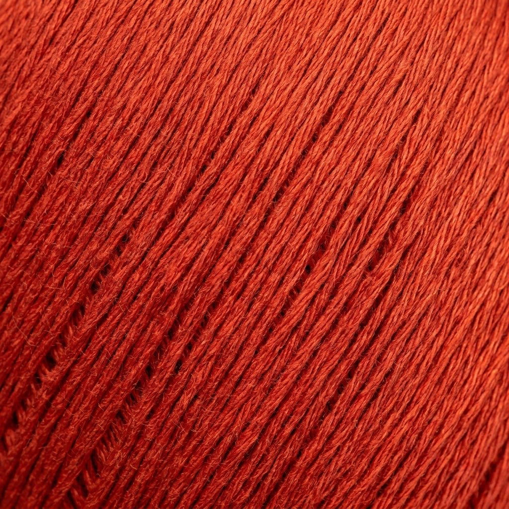
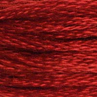
Somewhere between the warmth of a persimmon and the heat of a chili pepper lies the color territory where DMC 486 Medium Red Orange operates. It's emphatically both red and orange — neither one nor the other, sitting directly at the crossroads in a way that gives it maximum visual energy. Pure reds feel cool next to it; pure oranges feel warmer. In a palette, it creates heat. In a design, it draws the eye. This is not a subtle thread.
Red-Orange in Color Theory
The red-orange zone has specific properties in color theory that make it useful in cross-stitch design. It's the most visually advancing color on the spectrum — it appears to come forward off the fabric more than almost any other hue, making it excellent for foreground elements, focal points, and anything that needs to visually "pop" out of its surroundings. Designs that use 486 for primary subjects against cooler backgrounds (blues, greens, purples) achieve maximum contrast without needing to go all the way to orange or red individually.
In the DMC catalog, 486 sits between the pure reds like DMC 321 (Red) and the orange-reds like DMC 606 (Bright Orange-Red). It's warmer than 321 but cooler and less orange than 606, occupying the exact center of the red-to-orange transition. For stitchers building a palette that needs to include this zone, 486 is the definitive choice before you commit to one side or the other.
Animals, Nature, and Specific Design Applications
The animal kingdom is full of red-orange — a fact that keeps 486 in regular demand for wildlife cross-stitch. Red foxes are perhaps the most obvious application: the rich, warm-red fur of a Vulpes vulpes on a winter morning is almost precisely this shade in its midtone areas, with DMC 720 (Dark Orange Spice) for darker zones and DMC 3340 (Medium Apricot) for the lightest highlights. Red squirrels, robins' breasts (particularly European robins), and red pandas all share this quality of bright, warm, slightly orange-influenced red.
Beyond animals, 486 appears in autumn leaf designs where leaves have turned to the warmest red before falling, in tomato and cherry designs, in cardinal bird renderings, and in poinsettia and Christmas cactus flower designs where the specific warm-red of the bracts is closer to red-orange than to pure red. Fire and flame renderings use it as the hottest zone of the flame, where the color approaches white at the center.
The Challenge of Managing Intensity
Working with 486 requires thinking carefully about context. Its high visual energy means it can easily dominate a composition if used in large quantities. Stitchers who find that their WIP "looks like it's shouting" after stitching 486 areas have likely used it more broadly than the design balance can absorb. The solution is usually to extend the darker values (485, 304) further than the original design specifies, allowing 486 to appear only in the most forward, most lit areas where its energy creates accent rather than noise.
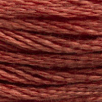
Red-orange is a notoriously variable zone between manufacturers, because it sits at a hue junction where different brands make different choices about exactly where to place their red-orange threads. Anchor 334 is the recommended match but runs somewhat more orange than the DMC original — worth knowing if the specific red component of 486 is important to your design. In many contexts, the Anchor version performs fine; in designs where the red quality of 486 needs to read against pure reds without appearing too orange, comparison testing is advisable.
Madeira 0209 is a closer match in terms of maintaining the red-orange balance. Madeira's threads in this hue zone tend to be well-calibrated, and 0209 should perform consistently and predictably. The dye colorfastness is good, which matters for a thread this saturated — vivid red-oranges can be among the more UV-sensitive colors.
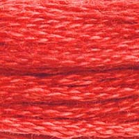
Cosmo 2613 is a workable substitute. Like the Anchor version, it may run slightly warmer (more orange) than the DMC original. Whether this matters depends entirely on how 486 is used in your specific design — as a standalone accent, the difference is minimal; in a carefully calibrated gradient including both cooler reds and warmer oranges, the shift can disrupt the intended progression.
Sullivans 45121 is adequate for general use. The intense saturation of red-orange shades can occasionally show dye lot variation in lower-cost brands, so verifying that multiple skeins from the same lot is particularly worthwhile here. For single-skein accent uses, Sullivans is fine.
Within DMC's range, DMC 606 (Bright Orange-Red) is one step warmer and more orange — a reasonable alternative if you want to push the palette warmer. DMC 321 (Red) takes it cooler if you want less orange influence.
Reference quality
How We Validate This Color Record
Use this page as a reference card for DMC 486: the structured data, quick conversions, and long-form copy are all tied back to the same stored color record.
- Methodology
- This page renders DMC 486, its hex value, and every brand equivalent from the site's source-of-truth color record, then checks long-form body copy against those same stored fields.
- Verification status
- Source-field checked. The page content is audited against the stored DMC number, brand equivalents, and match-quality labels before publishing.
- Last reviewed
- 2026-04-20
- Approximation warning
- Screen hex values, thread photos, and cross-brand conversions are reference aids. Dye lots, thread sheen, and fabric color can still shift the result in hand.
Decision guide
When to use the DMC 486 reference page
This page should help you decide faster between palette planning, brand substitution, and shade comparison without turning the color record into a thin lookup page.
Best for
- + Palette planning when you want the stored DMC 486 Medium Red Orange record, hex value #D03020, and linked brand equivalents in one place.
- + Checking the quickest cross-brand shortlist before you buy floss, compare stash substitutes, or route into a more specific conversion page.
- + Finding nearby shades in the reds family before you commit to accents, shading, or background blends.
Watch for
- ! Screen previews are only reference aids. Medium Red Orange can shift on real fabric because thread sheen, stitch coverage, and room lighting change how the color reads.
- ! A stored equivalent is still a shortlist, not a guarantee that two brands will disappear into each other in the same stitched motif.
- ! Older charts, discontinued kit floss, and dye-lot variation can all introduce small but visible differences that the page cannot detect for you.
Before you commit
- Confirm the role of DMC 486 Medium Red Orange: decide whether you need an exact hero shade, a forgiving background, or a rough stash substitute.
- Compare on project fabric: view the skein or stitched sample on the same fabric count and color you will actually use.
- Use the linked conversion pages next: open the brand-specific pages when you need match-quality caveats before substituting away from the DMC reference.
DMC 486 FAQ
These questions appear on the page so the FAQ schema stays aligned with what visitors can actually read.
What is the Anchor equivalent of DMC 486?+
The closest Anchor equivalent to DMC 486 (Medium Red Orange) is Anchor 334. This is a close match.
What color is DMC 486?+
DMC 486 is called "Medium Red Orange" and has a hex color value of #D03020. It belongs to the reds color family.
What is the Madeira equivalent of DMC 486?+
The closest Madeira equivalent to DMC 486 (Medium Red Orange) is Madeira 0209. This is a close match.
How DMC 486 Looks on Fabric
The same thread appears different depending on your fabric. Always test on your project fabric.
White Aida
Cream / Ecru
Black Aida
Pairs Well With
DMC colors commonly used alongside 486 Medium Red Orange.
Suggested Palette
Shading Companions
Detailed Conversions
Where to Buy DMC 486
This section contains affiliate links. We may earn a small commission at no cost to you.
Related Guides
Free Printable Thread Conversion Chart
Pick a brand, enter your email, and we'll send you a printable chart mapping all 552 DMC colors to that brand's equivalents. Zero spam, one chart.
Thanks! Here's your free chart:
Download Your ChartOpens in a new tab. Use your browser's Print → Save as PDF.
No spam. Your email is stored securely and never shared.