
Quick Conversion Table
| Brand | Equivalent | Match |
|---|---|---|
| Anchor | 11 | exact |
| Madeira | 0213 | close |
| Cosmo ⚠ | 344 | close |
| Sullivans | 45074 | close |
| J&P Coats | 2335 | close |
| Dimensions | 6029 | close |
| Bucilla | 1350 | close |
Fire in Thread Form
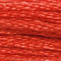
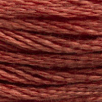
Strike a match in a dark room and watch the first second of flame — that initial flare before the fire settles into a steady burn. The color of that moment, warm and vivid and slightly orange-shifted, is DMC 350 Medium Coral. This is not the cool, composed red of DMC 304 or the deep sophistication of DMC 816. This is red with energy, red with heat, the kind of red that makes you think of things that glow.
The hex value (#E04848) tells a story of balanced warmth. High red, moderate green-and-blue in equal proportion — this is a red that leans warm without tipping into orange territory. It sits in that narrow zone between true red and coral where the color has enough yellow energy to feel alive but enough red to maintain its authority as a red rather than as an orange-red or a salmon. Some stitchers mentally file 350 under "coral" because of its name and skip it when shopping for reds. That is a mistake. This thread reads as red in finished pieces — warm red, lively red, but unambiguously red.
The Coral Gradient: 350's Family Position
DMC organizes its corals in a tight, useful gradient that every stitcher should know:
- DMC 349 (Dark Coral) — the deepest, most red-leaning member
- DMC 350 (Medium Coral) — the vivid, balanced core
- DMC 351 (Coral) — lighter, softer, more approachable
- DMC 352 (Light Coral) — gentle, almost peachy
- DMC 353 (Peach) — the palest, bridging into the peach family
This five-step gradient from 349 through 353 is one of the most versatile shading sequences in the entire DMC range. It covers the full journey from deep warm red to pale peach, and because each step is a consistent increment in both value and saturation, the transitions between adjacent shades are smooth and natural. For any subject that involves warm-toned shading — roses, flames, sunsets, skin tones, coral reefs — this gradient does the heavy lifting.
DMC 350 occupies the power position in this lineup. It is bright enough to serve as the primary color in a design, dark enough to carry visual weight, and warm enough to harmonize with the lighter members of the family above it. In most coral-themed palettes, 350 is where the eye lands first, with the lighter shades radiating outward as highlights and the darker 349 receding into shadows.
Flame, Warmth, and Seasonal Heat
Flame designs are an obvious application, and 350 excels at the middle zone of a fire — the region between the white-hot core and the dark red tips of the outermost flames. A five-color fire palette might run DMC 310 (Black) at the smoke edges, DMC 350 in the active flame zone, DMC 740 (Tangerine) in the bright body, DMC 743 (Medium Yellow) approaching the core, and DMC blanc at the hottest center. This physically accurate sequence — fire is hottest where it is lightest — creates convincing flame effects in cross-stitch.
For candle and fireplace scenes, popular in autumn and winter seasonal designs, 350 provides the warm glow that spreads across objects lit by firelight. Everything in a firelit room takes on a warm cast, and replacing the neutral highlight colors in a pattern with 350 and its family members (351, 352) simulates that warm ambient light convincingly.
Valentine's projects benefit from 350 when the designer wants warmth rather than formality. Where DMC 321 or 304 creates a classic, serious Valentine's red, 350's livelier energy suggests infatuation more than enduring love — it is the red of a first blush, a quickened pulse, excitement rather than commitment. For modern, playful Valentine's designs aimed at younger audiences, 350 is often a better fit than the traditional Christmas-adjacent reds.
On fabric, 350 performs reliably. Two strands on 14-count gives complete coverage with good color consistency. The warm tone interacts visibly with fabric color — on cream Aida, it warms further toward salmon; on white, it maintains its coral intensity. On black Aida, 350 practically glows, making it an excellent choice for dramatic contrast designs where warm accents punch through a dark background.
Strong Exact Matches Across Brands
Both Anchor 11 and Madeira 0213 carry exact match ratings for DMC 350, which makes cross-brand substitution straightforward. Anchor 11 replicates the warm coral-red accurately, with thread weight and coverage that parallel DMC's performance. No strand count adjustment needed, no color drift to worry about. This is one of those conversions you can make confidently without seeing both threads side by side first.
Madeira 0213 is equally reliable. The color match holds true, and Madeira's smoother finish at this particular shade does not change the visual character significantly — unlike some of the deeper, darker reds where Madeira's sheen creates a noticeably different surface quality, at 350's medium-light value the difference between matte and slightly sheeny is minimal.
Cosmo 344 is a close match. Be aware that Cosmo 344 also appears as a close match for DMC 817 (Very Dark Coral Red), which is a substantially darker thread. The two DMC colors are not interchangeable, so if your design uses both 350 and 817, you will need to find a different Cosmo shade for one of them. For projects using 350 alone, Cosmo 344 delivers an adequate coral-red with Cosmo's pleasantly soft hand.
Sullivans 45074 is rated close and shares a number with DMC 304's Sullivans match — another doubling issue. In practice, these two DMC colors (350 and 304) sit far enough apart in hue and value that the single Sullivans shade cannot truly serve both. If your project uses 350 only, test Sullivans 45074 for coverage and color accuracy on your specific fabric.
Within DMC, the closest substitutes are 351 (Coral, one step lighter) and 349 (Dark Coral, one step darker). If you genuinely cannot find 350, DMC 351 with a slightly tighter stitch tension can darken the visible color enough to approximate 350 — tighter stitches create denser coverage, which makes any color appear slightly more saturated. It is not a perfect solution, but it is a practical one.
Reference quality
How We Validate This Color Record
Use this page as a reference card for DMC 350: the structured data, quick conversions, and long-form copy are all tied back to the same stored color record.
- Methodology
- This page renders DMC 350, its hex value, and every brand equivalent from the site's source-of-truth color record, then checks long-form body copy against those same stored fields.
- Verification status
- Source-field checked. The page content is audited against the stored DMC number, brand equivalents, and match-quality labels before publishing.
- Last reviewed
- 2026-04-20
- Approximation warning
- Screen hex values, thread photos, and cross-brand conversions are reference aids. Dye lots, thread sheen, and fabric color can still shift the result in hand.
Decision guide
When to use the DMC 350 reference page
This page should help you decide faster between palette planning, brand substitution, and shade comparison without turning the color record into a thin lookup page.
Best for
- + Palette planning when you want the stored DMC 350 Medium Coral record, hex value #E04848, and linked brand equivalents in one place.
- + Checking the quickest cross-brand shortlist before you buy floss, compare stash substitutes, or route into a more specific conversion page.
- + Finding nearby shades in the reds family before you commit to accents, shading, or background blends.
Watch for
- ! Screen previews are only reference aids. Medium Coral can shift on real fabric because thread sheen, stitch coverage, and room lighting change how the color reads.
- ! A stored equivalent is still a shortlist, not a guarantee that two brands will disappear into each other in the same stitched motif.
- ! Older charts, discontinued kit floss, and dye-lot variation can all introduce small but visible differences that the page cannot detect for you.
Before you commit
- Confirm the role of DMC 350 Medium Coral: decide whether you need an exact hero shade, a forgiving background, or a rough stash substitute.
- Compare on project fabric: view the skein or stitched sample on the same fabric count and color you will actually use.
- Use the linked conversion pages next: open the brand-specific pages when you need match-quality caveats before substituting away from the DMC reference.
DMC 350 FAQ
These questions appear on the page so the FAQ schema stays aligned with what visitors can actually read.
What is the Anchor equivalent of DMC 350?+
The closest Anchor equivalent to DMC 350 (Medium Coral) is Anchor 11. This is an exact match.
What color is DMC 350?+
DMC 350 is called "Medium Coral" and has a hex color value of #E04848. It belongs to the reds color family.
What is the Madeira equivalent of DMC 350?+
The closest Madeira equivalent to DMC 350 (Medium Coral) is Madeira 0213. This is a close match.
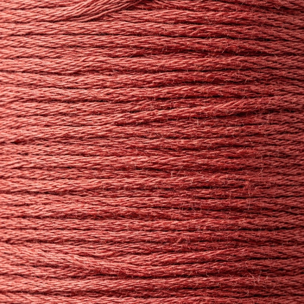
How DMC 350 Looks on Fabric
The same thread appears different depending on your fabric. Always test on your project fabric.
White Aida
Cream / Ecru
Black Aida
Pairs Well With
DMC colors commonly used alongside 350 Medium Coral.
Suggested Palette
Shading Companions
Detailed Conversions
Where to Buy DMC 350
This section contains affiliate links. We may earn a small commission at no cost to you.
Related Guides
Free Printable Thread Conversion Chart
Pick a brand, enter your email, and we'll send you a printable chart mapping all 552 DMC colors to that brand's equivalents. Zero spam, one chart.
Thanks! Here's your free chart:
Download Your ChartOpens in a new tab. Use your browser's Print → Save as PDF.
No spam. Your email is stored securely and never shared.