
Quick Conversion Table
| Brand | Equivalent | Match |
|---|---|---|
| Anchor | 26 | close |
| Madeira | 0504 | close |
| Cosmo ⚠ | 2611 | close |
| Sullivans | 45096 | close |
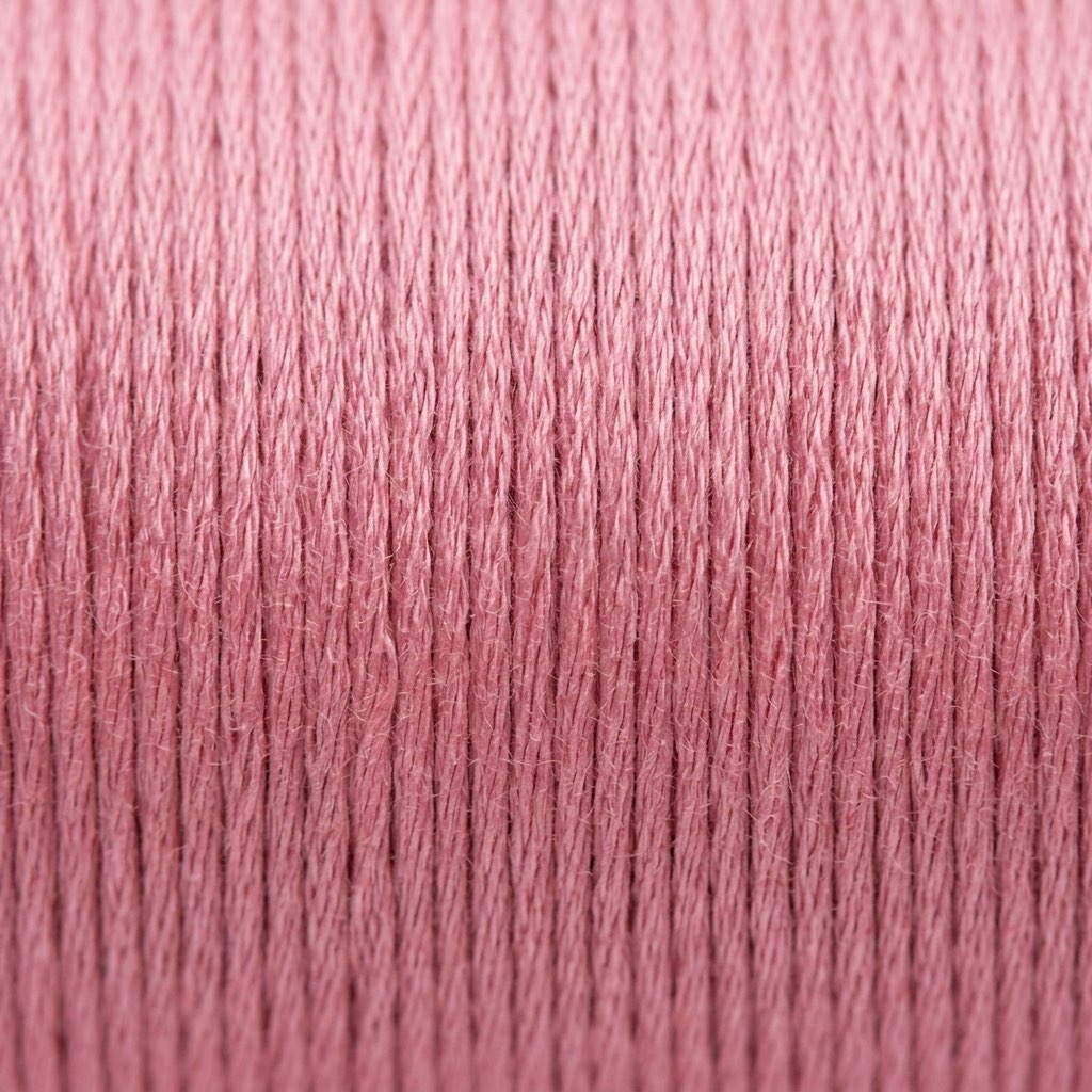
The Medium Pink That Gets Everything Right
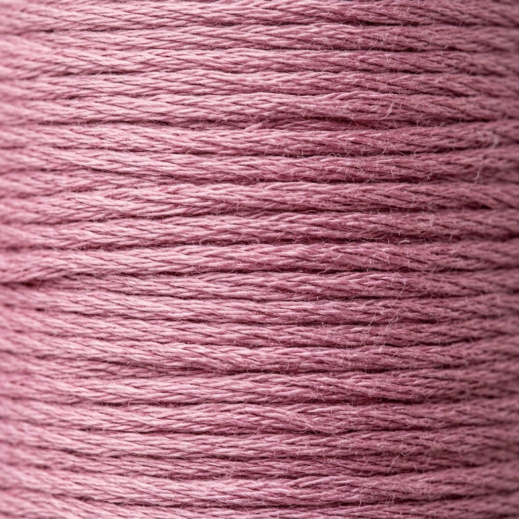
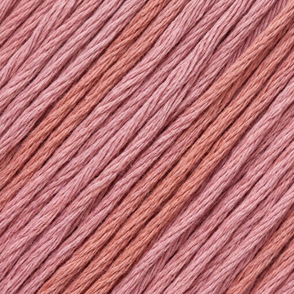
If you were designing a thread palette from scratch and needed a single pink that would work in the widest possible range of contexts, you'd probably end up inventing DMC 202. It's a medium pink — not too light, not too dark — with a balanced undertone that refuses to tip warm or cool. It's saturated enough to be unambiguously pink without the intensity that makes bolder pinks dominate a design. It is, in a word, useful. Not glamorous. Not dramatic. Just reliably, beautifully, universally useful.
Rose quartz as a color reference brings associations of warmth and softness, and 202 delivers on both. This is a pink that looks equally appropriate in a Valentine's Day heart, a peony petal, a little girl's ballet slipper, a flamingo's wing, and a sunset cloud. That versatility comes from its refusal to specialize — it doesn't commit to any single pink identity, which means it can adopt whatever identity the surrounding design gives it.
Compared to its lighter sibling DMC 201 (Light Rose Quartz), 202 carries more visual weight. Where 201 whispers pink, 202 speaks it clearly. This makes it better suited for foreground elements — the main body of a flower, the dominant tone in a heart motif, the primary pink in a design that needs pink to be one of its starring colors rather than a supporting player.
Valentine's Day and Romantic Motifs
February brings a spike in demand for medium pinks, and 202 is perfectly positioned for Valentine's Day projects. It's the pink of conversation hearts, of rose bouquets seen through slightly rose-tinted glasses, of romantic cards that say "love" in elegant script. Unlike the aggressive hot pinks or the deep, moody berry tones, 202 conveys romance in its most classic, unironic form.
For Valentine's designs, pair 202 with DMC 309 (Dark Rose) for shadow depth and DMC 201 (Light Rose Quartz) for highlights. Add DMC 816 (Garnet) or DMC 815 (Medium Garnet) for the deepest darks, and DMC 818 (Baby Pink) or Blanc for the lightest touches. This gives you a complete pink-to-dark-rose palette that handles everything from lacework borders to solid heart fills with dimension and contrast.
Heart motifs stitched in a gradient from 202 through its lighter and darker companions develop a three-dimensional quality — the curvature of a heart naturally creates areas of light and shadow, and a pink gradient makes those areas visible. A flat, single-color heart reads as a symbol; a shaded heart reads as an object that exists in space, catching light on its upper curves and falling into shadow at its edges.
Peony Work and Botanical Accuracy
Peonies are one of the most popular floral subjects in cross-stitch, and their complex, layered petals demand a careful approach to pink. The outer petals of a pink peony are typically lighter — DMC 201 or DMC 3689 (Light Mauve) territory — while the inner petals, crowded and overlapping, create shadows in medium pink ranges. That's where 202 excels. It's the body color of a pink peony, the shade that covers more of the flower's surface area than any other single value.
For botanically accurate peony work, build a gradient of at least four values: DMC 3350 (Ultra Dark Dusty Rose) or DMC 3687 (Mauve) for the deepest shadows between petals, 202 for the mid-toned petal surfaces, DMC 201 for the light-catching outer petals, and DMC 818 (Baby Pink) or DMC 225 (Ultra Very Light Shell Pink) for the brightest highlights where petals thin out at their edges. The neutral undertone of 202 ensures it plays nicely with both the cooler shadow tones and the warmer highlights.
Thread painting techniques — long-and-short stitch in surface embroidery, or carefully planned cross-stitch shading — show 202 at its best. The even saturation and balanced hue mean it transitions smoothly in any direction: darker, lighter, warmer, cooler. Not every pink can make that claim. The ones that lean heavily warm or cool create awkward transitions when asked to meet their complementary opposites.
Maintaining the Neutral Balance
The key word for substituting 202 is "balance." This thread sits at the center of the pink spectrum — not warm, not cool, not too grey, not too clean. Most substitute pinks will lean one direction or another, and the question is whether that lean matters for your specific project.
Anchor 26 is close and generally maintains the balanced pink quality. Madeira 0504 is also close and may carry a fractionally silkier finish, which at this medium value can add a subtle luminosity. Cosmo 2611 approaches from Cosmo's color perspective, which sometimes leans a touch warmer in the pinks. Sullivans 45096 is another close option.
Because all substitutes are rated close rather than exact, testing is essential. Stitch three or four crosses on your actual project fabric, view from arm's length in daylight, and compare to your other palette colors. A substitute that looks fine in isolation might reveal its warm or cool bias when placed next to its intended neighbors.
Within DMC, the threads closest to 202's territory include DMC 3688 (Medium Mauve), which is a similar value but leans cooler and more purple, and DMC 223 (Light Shell Pink), which is similar in value but warmer. DMC 3354 (Light Dusty Rose) is lighter and cooler. If your design uses 202 alongside its sibling 201, maintaining consistent undertone across the gradient matters more than if 202 appears in isolation. For a standalone element — a single heart, an accent detail — the nearest available pink in the right value range will usually work. For a multi-value gradient where 202 is one step in a careful progression, prioritize undertone matching over convenience.
Reference quality
How We Validate This Color Record
Use this page as a reference card for DMC 202: the structured data, quick conversions, and long-form copy are all tied back to the same stored color record.
- Methodology
- This page renders DMC 202, its hex value, and every brand equivalent from the site's source-of-truth color record, then checks long-form body copy against those same stored fields.
- Verification status
- Source-field checked. The page content is audited against the stored DMC number, brand equivalents, and match-quality labels before publishing.
- Last reviewed
- 2026-04-20
- Approximation warning
- Screen hex values, thread photos, and cross-brand conversions are reference aids. Dye lots, thread sheen, and fabric color can still shift the result in hand.
Decision guide
When to use the DMC 202 reference page
This page should help you decide faster between palette planning, brand substitution, and shade comparison without turning the color record into a thin lookup page.
Best for
- + Palette planning when you want the stored DMC 202 Rose Quartz record, hex value #E898B0, and linked brand equivalents in one place.
- + Checking the quickest cross-brand shortlist before you buy floss, compare stash substitutes, or route into a more specific conversion page.
- + Finding nearby shades in the pinks family before you commit to accents, shading, or background blends.
Watch for
- ! Screen previews are only reference aids. Rose Quartz can shift on real fabric because thread sheen, stitch coverage, and room lighting change how the color reads.
- ! A stored equivalent is still a shortlist, not a guarantee that two brands will disappear into each other in the same stitched motif.
- ! Older charts, discontinued kit floss, and dye-lot variation can all introduce small but visible differences that the page cannot detect for you.
Before you commit
- Confirm the role of DMC 202 Rose Quartz: decide whether you need an exact hero shade, a forgiving background, or a rough stash substitute.
- Compare on project fabric: view the skein or stitched sample on the same fabric count and color you will actually use.
- Use the linked conversion pages next: open the brand-specific pages when you need match-quality caveats before substituting away from the DMC reference.
DMC 202 FAQ
These questions appear on the page so the FAQ schema stays aligned with what visitors can actually read.
What is the Anchor equivalent of DMC 202?+
The closest Anchor equivalent to DMC 202 (Rose Quartz) is Anchor 26. This is a close match.
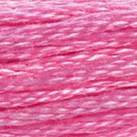
What color is DMC 202?+
DMC 202 is called "Rose Quartz" and has a hex color value of #E898B0. It belongs to the pinks color family.
What is the Madeira equivalent of DMC 202?+
The closest Madeira equivalent to DMC 202 (Rose Quartz) is Madeira 0504. This is a close match.
How DMC 202 Looks on Fabric
The same thread appears different depending on your fabric. Always test on your project fabric.
White Aida
Cream / Ecru
Black Aida
Pairs Well With
DMC colors commonly used alongside 202 Rose Quartz.
Suggested Palette
Shading Companions
Detailed Conversions
Where to Buy DMC 202
This section contains affiliate links. We may earn a small commission at no cost to you.
Related Guides
Free Printable Thread Conversion Chart
Pick a brand, enter your email, and we'll send you a printable chart mapping all 552 DMC colors to that brand's equivalents. Zero spam, one chart.
Thanks! Here's your free chart:
Download Your ChartOpens in a new tab. Use your browser's Print → Save as PDF.
No spam. Your email is stored securely and never shared.